
Why Black and White Art Still Stops People Cold
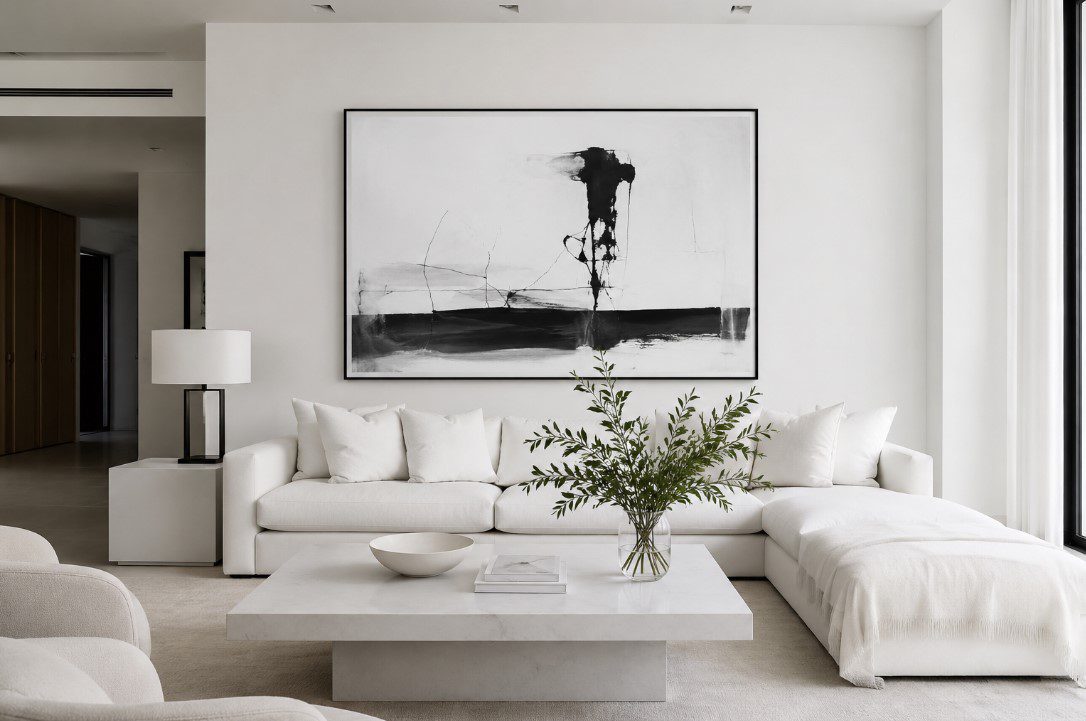
In a bright, minimalist space, a black-and-white statement piece draws the eye and anchors the entire room.
Walk through the Figge Art Museum in Davenport on a busy Saturday, and you’ll notice something. Among all the color-saturated canvases, the textured abstracts in rust and ochre, the photographs printed in deep jewel tones, there’s often one piece that makes people slow down without knowing why. It’s usually the black and white one.
That’s not a coincidence. The Quad Cities has always been a community that takes its arts life seriously – from the 75+ regional artists represented through Quad City Arts to the public murals and gallery shows scattered across Rock Island and Moline. And in that context, black and white painting holds a particular kind of authority. It doesn’t ask for your attention. It commands it.
The Quiet Power of Black and White Art
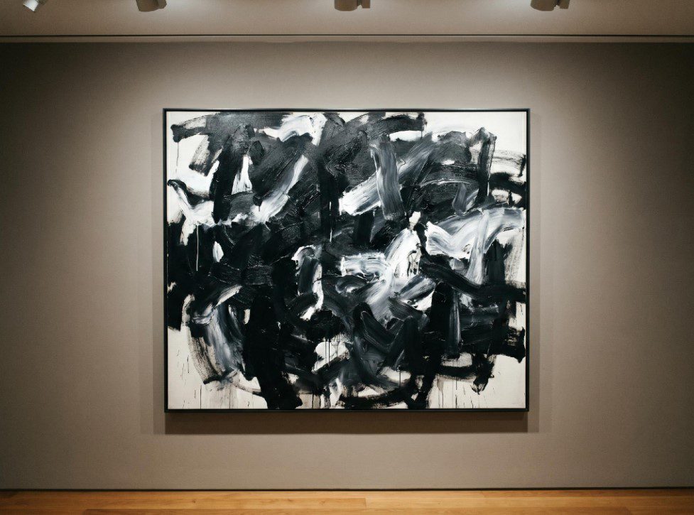
A black and white abstract painting commands attention without the competition of color.
Strip away color and something interesting happens. The viewer stops processing hue and starts reading everything else: the weight of a brushstroke, the tension between a dark mass and open space, the way light catches a textured surface. Nothing distracts from those things when there’s no color pulling focus.
This is why the tradition runs so deep. Medieval painters used grisaille – a technique of painting entirely in gray tones – to simulate the look of stone sculpture. Picasso painted Guernica in 1937 entirely in black, white, and gray, making a deliberate choice to strip the horror of the Spanish Civil War down to something raw and unavoidable. Ellsworth Kelly’s “Black with White” from 1964, held in the Smithsonian American Art Museum’s collection, does the opposite – it reduces painting to its most elemental: two shapes, two tones, total focus.
Contemporary artists carry this tradition forward. Painters working in black white painting today treat the absence of color not as a constraint but as the whole point – a way to force both artist and viewer to reckon with form, contrast, and emotion on their own terms.
That kind of clarity is hard to achieve. It’s also hard to ignore.
Why the Trend Isn’t Going Away
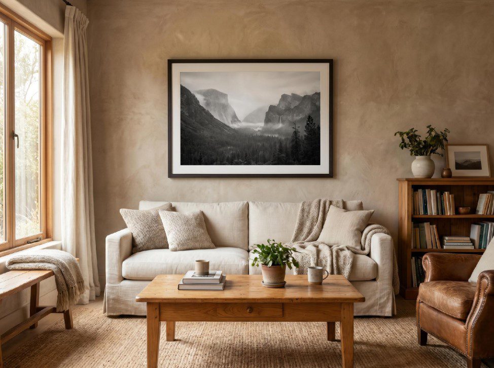
Black and white artwork anchors a room and pairs with virtually any color palette.
Some art styles cycle in and out. Monochrome painting doesn’t. It’s been a constant thread through Western art for centuries, and the numbers from the broader design world back that up.
Behr Paint’s 2024 consumer research found that 64% of Americans say black tones make a space feel bold, and 74% said they’d consider painting a room a dark color. That appetite for high-contrast, stripped-down aesthetics in home environments translates directly to what people hang on their walls. A room painted in warm gray or deep charcoal looks different with a black and white painting on it than it does with a colorful one – more deliberate, more settled.
Monochrome work draws a viewer’s attention to the materiality of paint itself – texture, surface, the physical presence of the medium. That’s an experience you can’t replicate with a print or a photograph. It’s why original monochrome paintings continue to hold real value for collectors, not just decorators.
Data from Russell Collection’s 2024 art market research adds another piece: 46% of active art collectors are now aged 18 to 39. That’s not a niche cohort – it’s a generation that grew up with phones and social media and has developed a visual literacy that responds well to restraint. Black and white art reads well on a screen and even better in person.
Finding Black and White Art Close to Home
The Quad Cities doesn’t need to import its arts culture. The region has its own.
Quad City Arts has been operating for more than 50 years, and local nonprofit arts organizations across the area generate a combined economic impact of over $71 million, according to Quad City Arts’ own reporting. That number matters because it means there’s a real, active network of artists, galleries, and buyers here – not just passive appreciation.
If you want to start looking at original black and white work in person, the art galleries in the Quad Cities directory is a practical starting point. It covers galleries in Davenport, Rock Island, Moline, and surrounding areas – many of which show regional artists working in a range of styles, including work that leans heavily on contrast and minimalism.
Online platforms have also made it easier to find artists beyond geography. A collector based in Bettendorf can follow a painter based in Chicago or New Mexico, follow their process on social media, and buy directly. That’s changed how people build collections – and it’s made original art, including original black and white painting, more accessible than it’s been at any point in recent memory.
How to Display Black and White Art at Home
One common hesitation with black and white artwork is the fear of getting the display wrong. That’s largely unfounded. Black and white works against almost every wall color – warm creams, cool grays, deep greens, even bold navy. Because it doesn’t compete with the room’s color palette, it tends to anchor rather than fight.
A few practical things worth considering:
Scale matters more than almost anything else. A small black and white piece on a large wall reads as an afterthought. One strong, well-sized work – sized to fill roughly two-thirds of the wall space above a sofa or console table – reads as intentional.
Texture in the surrounding space softens the contrast. A black and white oil painting near natural wood furniture, linen curtains, or a woven rug sits differently than the same piece in a room full of hard, reflective surfaces. The softer materials absorb some of the graphic tension and let the painting breathe.
Lighting makes a real difference. Direct sunlight is hard on paint over time, fading pigment and drying out the surface. Position the piece where it gets good ambient light but not direct afternoon sun, and it’ll hold up for decades.
You don’t need to be a serious collector to make a good choice here. If a piece makes you stop and look at it for more than a few seconds, that’s usually enough reason to buy it.
A Region That Knows What It’s Looking At
The Quad Cities arts scene has always had a strong sense of its own identity. People here know the difference between art that’s decorating a space and art that’s changing it. Black and white painting sits firmly in the second category – not because of any rule, but because restraint done well is its own kind of statement.
Whether you find a piece at a local gallery, through a regional artist’s studio, or by searching online, the logic is the same: a single well-chosen black and white work does more for a room – and for the person living in it – than a dozen safe, forgettable choices.


Leave a Reply
You must be logged in to post a comment.